Choosing a background fabric that complements the rest of the quilt can sometimes be challenging, and that’s where knowing all about background fabrics can help. Whether you’re a new quilter or have dozens to your name, we have a beginner’s guide to background fabrics to help you out.
Quilts just look good when you coordinate (or contrast) your background fabric with the other fabrics in your quilt for a seamless design! Background fabrics are the figurative canvas that makes the designs and blocks in a quilt pattern stand out and take shape. Background fabric normally contrasts with the quilt blocks and form the sashing and borders of a quilt. They can be dark or light fabrics (or something in between), but white, cream and other light tones are commonly used.
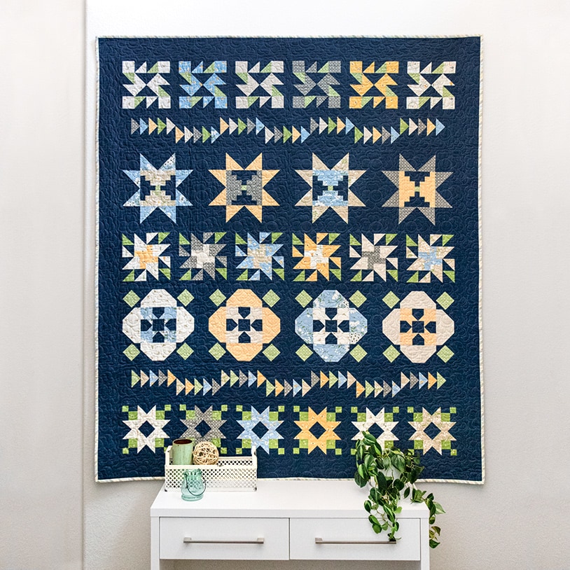
The blocks in our 2021 Charity Quilt, Serendipity, are set against a navy background fabric.
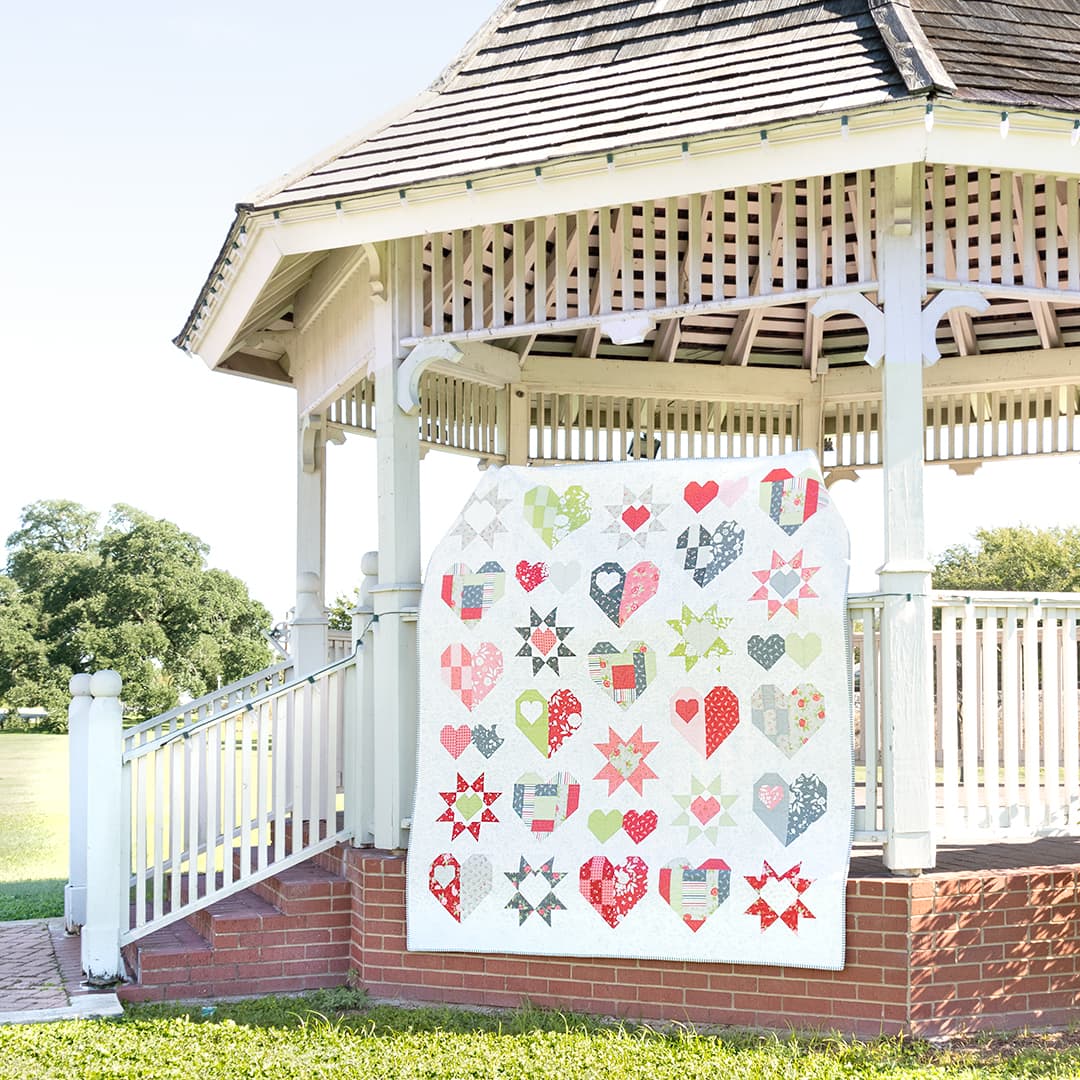
This year’s 2022 Heartfelt Charity Quilt, Heartfelt, has a light background.
Today, we’re showing you the differences between all of our favorite background fabrics and how we use them in our quilts. Read on to learn everything you need to know about choosing background fabric for your next quilting project!
White Bella Solids Backgrounds
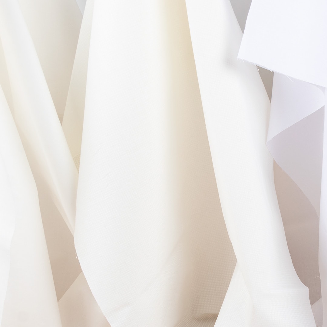
Many white fabrics look the same to the naked eye and your digital screen until they are side-by-side! With dozens of white, ivory, and cream fabrics you have many options for finding a complementary background for your quilt.
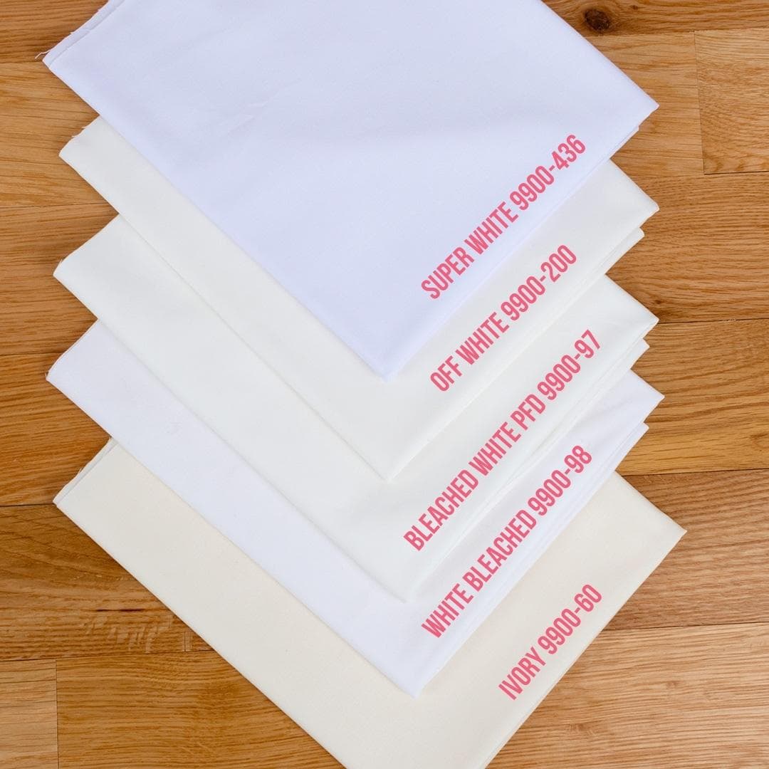
Our favorite white Bella Solids background fabric is Off White 9900-200. This fabric has a slightly creamy undertone and is especially good for working with many contemporary fabric collections.
We recommend White Bleached 9900-98 for when you want a brighter white background fabric. This can go with many modern fabric collections with bright white accents or cool undertones. This fabric will be brighter than its PFD counterpart, mentioned below, as it has finished the dyeing process and is optimized for brightness.
Another popular fabric choice is Bleached White PFD 9900-97. This fabric is labeled PFD because it is Prepared for Dyeing. According to Moda Fabrics, this solid is not one to use with other colors until it is dyed, as it will absorb stains in the wash. This is an excellent choice for tie-dying or hand-dying.
Other Bella Solids range in tone from Super White 9900-436, which is a pure, bright white verging on the cool side of the spectrum, to Ivory 9900-60, which is true to its name. These would all make excellent choices if you’re looking for a solid background for your quilt.
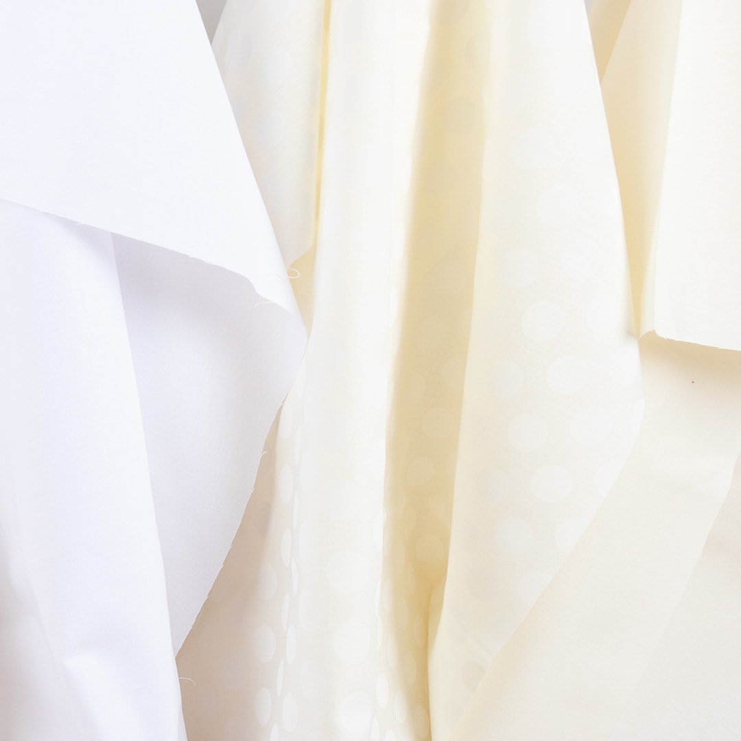
White-on-White Background Fabrics
An excellent option for many quilters is to use tone-on-tone backgrounds, which add a touch more dimension than solids. On the lighter end of the spectrum, the white-on-white (WOW for short) fabrics have light-colored prints on top of various shades of white or cream background fabrics.
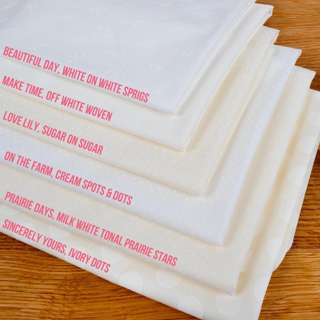
Kimberly’s Tone-on-Tone Favorites
Kimberly has a selection of go-to tone-on-tone background fabrics that you’ll see in many of her quilts.
- Beautiful Day, White on White Sprigs by Corey Yoder for Moda Fabrics
- Make Time, Off White Woven by Aneela Hoey for Moda Fabrics
- Love Lily, Sugar on Sugar Lovely by April Rosenthal for Moda Fabrics
- On the Farm, Cream Spots & Dots by Stacey lest Hsu for Moda Fabrics
- Prairie Days, Milk White Tonal Prairie Stars by Bunny Hill Designs for Moda Fabrics
- Sincerely Yours, Ivory Dots by Sherri & Chelsi for Moda Fabrics
Low Volume Club
Low volume fabrics are another excellent choice for creating a soft and subtle look with more interest than a plain white fabric might give you. They are prints that have subtle or neutral patterns that can read as a solid from afar. They don’t have much contrast, which is where the term low volume comes from. Any color print can be called a low volume if it meets that bar, but we often think of white or light backgrounds with subtle prints in this way.
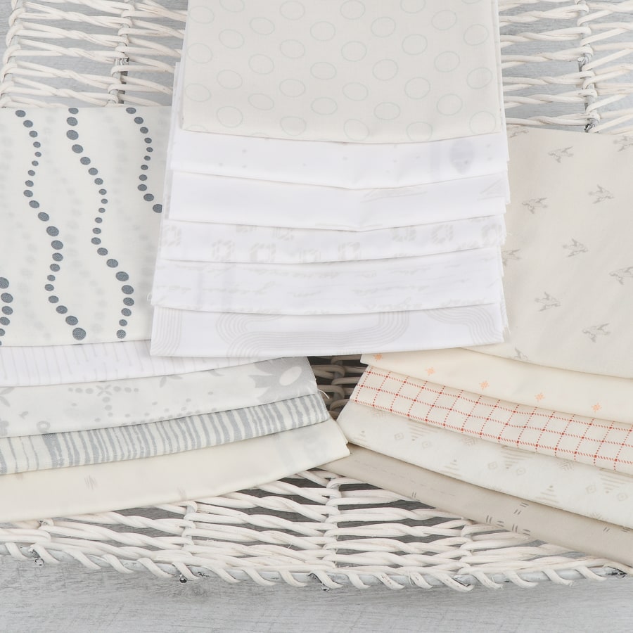
If you want to try these out, a great place to start is the Low Volume Fat Quarter Club. It is an opportunity to discover what you like best for backgrounds. Fat Quarter Shop’s Low Volume Club is perfect for building or adding to your stash of Low Volume fabrics with an assortment of Fat Quarters each month until you find the background fabrics that speak to you!
Low volume fabrics are nice to use in contrast to solid, saturated colors for a modern look or paired with other prints for an all over scrappy feel.
Share with FQS
Whether you’re using them as the background, backing, and binding of your quilts or for other crafty projects, these background fabrics are just some of the many tools in a maker’s toolbox. Find them alongside your favorite precuts, and let us know in the comments if there are other fabrics you’d like to learn more about.
Background fabrics are versatile and can be used in so many ways. Be sure to share your favorites with us on Facebook and Instagram and tag @fatquartershop so we can see and share your work!
Happy quilting!
Stay connected to Fat Quarter Shop!


16 comments
Thank you for this information on background fabrics. Sometimes this is the hardest choice when making a guilt.
I make a lot of quilts with reproduction fabrics – and of course shirtings are my go-to fabrics for backgrounds!I tend to not use solids very much at all in any quilts, regardless of the genre. I prefer small prints – sometimes tone-on-tone – and tend to go darker than white/off-white – light grey is good too!
Thanks so much for this post, this is so aclaratory, really with a lot of pictures and super specific. Thanks so much, I learn a lot with it I love Bleached white and big Ivory Dots.
My favourites are the Basic Grey grunge line. I’ve used a lot of the creams, whites, greys and even navy and red. I like them because they give interest and movement to the background.
This is very helpful and I will keep it handy for future reference.
I have used Moda’s off white 9900-200 often over the years, but am glad to have these other suggestions, especially the tone-on-tone fabrics.
Thank you!
I buy bolts of white, off white, beige, black, navy, and red to keep around for backgrounds (or often used in patterns) so I always have what I need.
I’m a hand quilted, and I’ve found that for some reason *some*white on white fabrics are extremely difficult to stitch by hand. And the cheaper the fabric— think big box or chain fabric store—the worse the problem. I have t had that problem with Wilmington Essentials or white on white fabrics from companies that you would find from FQS. I made Aunt Millie’s Flower Garden with w-on-w backgrounds and it is still unquilted. I started in the one block where I used something old from my stash and it’s impossible for me. I still haven’t decided what to do about it.
Hi Joana!
I’m sorry to hear that! Some of the WOW fabrics are screen printed, and the additional ink can make it harder to pierce the fabric. The high-quality 100% quilting cottons we carry are going to be better than what you find in a big box store. As for anything you did purchase with us you can always contact Customer Service and they would be happy to help you sort things out.
Here’s their email: service@fatquartershop.com
Very useful information! Bookmarked for future reference.
Regarding the WOW, or White on White fabrics, it would be helpful if you showed a grey with contrast picture of the fabrics. Some shops do, and it is very beneficial when trying to determine the pattern/ texture. Thank you.
Thank you for the tutorial! As always, great information to save.
I just received the Coriander white on white medallion fabric to use as background on Christmas quilts I will make in 2023. I love this fabric as the medallions give the fabric a lacy look and will be great in the quilts. I also like Lori Holt’s cream shabby fabric which I have used for one quilt and am using it for another. Her shabby fabric gives the quilts a vintage vibe. Thanks for providing such fantastic fabrics.
During a state-to-state move a length of Bella PFD9900-97 was mixed in a group of other Bella Whites. Is the a simple way to test this group without pre-washing and setting with vinegar or mordant?
Thank you, this is great. Can you please tell me where the porcelain bella fits in (182)? Is it closer to 200 or to 60? Thanks!
Hi Jennifer!
I would say that the Bella Solids Porcelain is similar to 60 in the shade’s off-white and yellow hues. But it’s warmer not as cool toned.
Hope this helps!
Thank you for answering my question about this on YouTube. Very helpful information. I am screenshot ting and printing for my notebook.