Welcome back to our Friday Feature! Please welcome Chelsey Kilzer as our FQS staffer of the week!

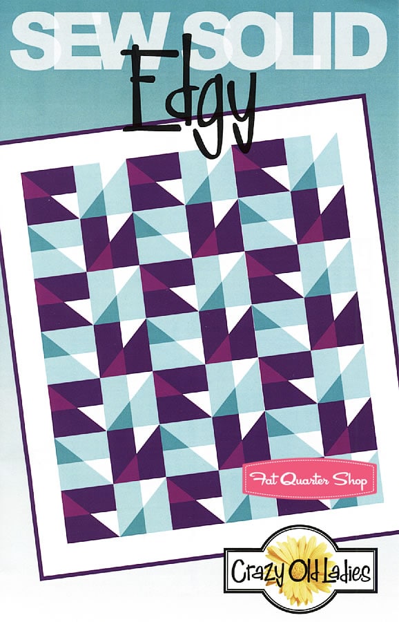
She chose the following pattern to feature this week:
Now, it’s time to announce the winner from last week’s blog post.
The lucky winner is….
For a chance to win a $50 gift certificate to our website, leave ONE comment on this blog post with the name of your chosen fabric collection. Be sure to include an email in your comment!
The directions for Pattern Play can be found here.
Next week is Quilt Market in Portland so we have EXTENDED our dates, you now have until Tuesday, May 21st to submit your comment and the winner will be announced Friday, May 24th, so be sure to come back to see if YOU are the winner!
138 comments
I think I'd use Gray Matters by Jacqueline Savage McFee for Camelot Cottons. I would use the yellows for the lighter blocks and the grays for the darker blocks. I think it would be a softer look but still fun.
I would be tempted to try it in something like the smaller prints from Kate Spain's Honey Honey.
I would use Razzmatazz Hipster by Riley Blake. The reds and oranges would look great, I think!
I suggest Happy Tones by Michael Miller fabrics. The colors would really pop in this edgy design!
I think Noteworthy would be great for this pattern. It would be very spring-like.
I would use Oval Elements by Pat Bravo for Art Gallery. I think this quilt would be fun in an assortment of the colors. jfinch@kingwoodcable.net
I think I would love to use stonehenge for this pattern..they have some nice color and prints available.
sskcraftshop(at)gmail(dot)com
I really like the Cheddar Delight Batiks from Hoffman!
I think this pattern would be fun in ship shape by Alice Kennedy. The reds would be the lights and the blues the darks with white as the background. Kelly_dunahoo@yahoo.com
I think it would look great in Cerise Edges by Laura Gunn! Thanks for the chance to win! mom2ryandsis(at)yahoo(dot)com
There's so many beautiful lines to choose from. I don't know, but I think I'm leaning towards Cool Peace Carnaby Street or Golden Spirit Bijoux.
I'd use the collection of Lori Holt's solids.
Shades of Black by Me and My Sister for Moda. All thoses black and white prints and tone on tones would be great!!
I think this pattern would be fun made up in Madhuri by Quilted Fish for Riley Blake.
Sweetwater's The Boo Crew fabric in this pattern would make a realy cute Halloween quilt!
marydeckert(at)comcast.net
I think Kansas Troubles, Pheasant Hill Pond would look great.
Thanks,Donna
makreyno@indiana.edu
Madhuri is phenomenal! I would love to make the quilt shown with the large star patterns in all those beautiful colors. What an inspiration!
What about Edges by Laura Gunn? Seems fitting. 🙂
I would use Michael Miller Cotton Couture in Khaki, Kryptonite, Lagoon and Lava!
Hello Happy Friday!
I would enjoy seeing the Argle Madison Manor in that quilt. I think it would awesome.
Shelly
shellymccarv@hotmail.com
I think it would look amazing in Liquorice Bali by Hoffman. Thanks.
I'd like to see this in something beautiful but not too busy – like simply color.
I think Amanda Herring's Madhuri would be perfect!
Steel and Saffron Edges by Laura Gunn…ohhh what lovely fabrics.
I think this pattern would be nice in Mulberry Lane.
I can totally see it in Fresh by Another Point of View for Windham Fabrics.
I would choose Happy Go Lucky!
hildy(at)ebertzeder(dot)de
I would like to keep the solid type style and go with V and Co. Simply Style.
I think a combination of Laura Gunn's edges would look great with this pattern – like a dark/light combo of teal, a dark/light combo of yellowis green, and use the platinum tonal mosaic in place of the white in the pattern. Thanks for a chance to win!
Bethnin AL
It might be nice in Small Cotton Dots from Riley Blake.
I would definitely use fabrics from the Stonhenge crayon box line, I just finished up a quilt using this line (and the stonhenge white as a background) and it is stunning, such wonderful colors!
I think Gray Matters would be gorgeous.
sdjg(at)pacbell(dot)net
I'd love to see Global Bazaar in purple with this pattern! Thanks!
I think Paintbox batons would look great!
Being such a fun, modern pattern, I'd love this in Comma,.
shauna(dot)gunnell(at)gmail(dot)com
Cypress Starry Night Stonehenge
With a name like "Edgy", it has to be Laura Gunn's Edges. And there are plenty of light/dark color selections to choose from in that collection.
Aunt Grace Centennial Solids by Judie Rothermel would be lovely!
Silverize at hotmail
I think Oval Elements by Patricia Bravo for Art Gallery Fabrics would look pretty cool with the straight lines of this pattern. Thanks for the chance to win! Love FQS!
mrs(dot)hbraun(at)gmail(dot)com
Salt Water and Kona Ash. I think it would look wave like.
I think Enchanted Pond by Holly Taylor would look nice in this quilt!
carin(dot)aschan(at)hotmail(dot)com
Comma. It's still one of my favorites. Thanks!
hello, I think "mama said sew" from sweetwater,moda would look great, I love the red/white/gray combination,
thanks for the chance!
lecluysekatelijn@hotmail.com
This would be nice in Comma.
I think this pattern would look very cool in Vintage Modern. Thanks!
I think using a few contrasting prints from the Happy Go Lucky line by
Bonnie & Camille for Moda Fabrics would be nice.
Birds of Paradise Batiks by Hoffman Fabrics would be gorgeous!
I would love to keep this towards the solids too, so I would pick Citrus Moda Marbles. I love the bright colors!!
I would use Bake Sale by Lori Holt from Riley Blake.
Judy W.
jawierman@yahoo.com
Oh I think Jamie Wood's Little Surfer Boy in Wave would look so cool!
Lovely pattern and I'm a fan of the Batiks so I'd have to agree with you that the Mint Julep Batiks would make this quilt pop. Thanks for the chance to win.
I think this would look neat in Christmas Countdown.
bveinotte at juno dot com
I was leaning toward Sketch by Timeless Treasures, but I think I'd go with Tonga Joy instead for a bright yet serene Christmas look.
I'd like to sew this pattern in Happy Go Lucky!
I know the pattern says "Sew Solid", but I think it would look great using a combo of Westminster Fabric's "First Impressions" and "Initial Impressions" collections!
I can see a Fall quilt made from this pattern using Calico Corn Kona Solids.
i would use Mulberry Lane to make this quilt!
I think I have to say Sketch by Timeless Treasures – I think that would be fun, and I couldn't mess it up too much! 😉
I believe I would use Michael Miller's Red and Aqua! Skgbrownms@comcast.net
I would use the blues and greens from Lori Holt's Solids
addibrae(at)hotmail(dot)ca
Thomas Knauer's Jellybeans would be perfect.
jane[dot]bitz[at]gmail[dot]com
I'd definitely pick 2 from the Azure Edges and 2 from the Saffron Edges collections (by Laura Gunn for Michael Miler. How edgier could you get?
I'd love to see it in Comma!! 🙂
I would use Madhuri – I really love this new collection 🙂
Pure Elements in Coral Reef & London Red, and Moonstone & Mystic Grey.
I think Simple Marks by Malka Dubrawsky would add an interesting texture to this graphic design.
I would use the Phoebe Fat Quarter Bundle – Another Point of View for Windham Fabrics
I'd like to use Scarlet Next Wave by Studio 37 for Marcus Brothers Fabrics.
I think simply color would look great!
I would like to try it in Gray Matters. Love this collection.
Love Blueberry and Lime Boho Girl:)
I think Chateau would be pretty!
nrbird (at) gmail (dot) com
I'd like to use Bake Sale by Lori Holt.
Sunset by kona babscorbitt@gmail.com
Maybe Ombre Dots by Riley Blake? The contrast of dots and edgy lines would look really interesting.
azwaazman @ gmail . com
I love the Small Cotton Dots by Riley and think they would be lovely in this quilt.
Thanks for the giveaway.
This pattern would look beautiful made from April's Garden.
Id use fabrics from French General.
I think I pick the Team Spirit Stonehenge Fat Quarter Bundle of Northcott Fabrics !
I think it's be fab in comma the yellow and grey
I would use Shades of Black by Me and My Sister. I would look very graphic and striking in black and white with a touch of grey.
Have fun at Quilt Market. I look forward to seeing your pictures, videos and hearing your insights. Next best thing to being their.
I think I'd pick Hoffman Brown Sugar Bali Batiks.
SewCalGal
http://www.sewcalgal.blogspot.com
I would love to use Bake Sale by Lori Holt. So cute.
Stonehenge with a mix of these bundles:
Indigo Aphrodite Stonehenge
Sangria Gold Leaf
Raven Aphrodite
mlwright29(at)hotmail(dot)com
I'd love to see this pattern using Wave Little Surfer Boy! Thanks for the chance ~ fingers crossed!
gms5997@yahoo.com
I would try it in Happy Tones by Michael Miller.
Thanks – Deb
dr392809@gmail.com
My chosen fabric collection would be the new "Winter's Lane". Thanks for the chance.
I think I would use Comma
I'd love to see the white areas in the Hipster Pop by Riley Blake and then the colored portions of the block in RB solids.
I'd use Comma!
I think that Fall Fun by Stella Jean for Willmington Prints, and this pattern would make a fun autumn quilt.
Debi Horne
debihonr54@yahoo.com
I have always wanted to use Mulberry Lane for a quilt.
Comma.. black, slate and mustard for this one..
Shades of black for sure! thank you!
I would use Oval Elements.
It would definitely have to be Edges by Laura Gunn for Michael Miller Fabrics.
Thanks for the chance to win!
cdgearey@hotmail.com
It's not in the shop yet, but Road 15 by Moda.
I think Snowman Gatherings would be cute in the quilt.
This comment has been removed by the author.
Saffron Edges by Laura Gunn for Michael Miller Fabrics would be so warm and summery looking
I'd love to give it a try in PB&J.
I think it would be lovely in the Rose Bud collection
i love the Children at Play Collection by Sarah Jane for Michael Miller Fabrics
I really love the purple and aqua color scheme of the photo quilt on the pattern, so I would stick with those colors. And since I love Riley Blake, I would choose purples and aqua from some of their many lines, like the tone-on-tone dots and stars, and Hipster, and Shuffle.
I think this quilt would look awesome with Alexis' Winter Garden
I'd like to use sketch fabrics from timeless treasures to give it a subtle texture.
Sweet cakes by Riley Blake designs would be wonderful.
I love the colors in the Sunset Kona Cotton fat quarter bundle so I would use those.
onlybas(at)aol(dot)com
I'd use Oval Elements along with Kona Solids. edrin1932@gmail.com
Saffron Edges Fat Quarter Bundle
Laura Gunn for Michael Miller Fabrics
Hoffman Bali RED HOTS is the best choice for this quilt.
sewbeads at yahoo dot com
I would like to try Blueberry and Lime Boho Girl by Debra Valencia. Thanks for the giveaway.
I would use the Moda Seascapes! And then quilt some wavy pattern on it.
I'd love to see this pattern in Odds and Ends by Cosmo Cricket. Many thanks!
I really like the Mill Book Series for Moda….very pretty. Thank you for the chance in this giveaway.
thim3@hotmail.com
I'd like to see what this would look like in Feathered Friends by Deborah Edwards. Thanks!
I would like to see the Chambray Rose collection. Just for something different.
smjohns63 at yahoo dot com
Sweet Cakes by Riley Blake is nice.
mystica123athotmaildotcom
I think Over the Rainbow Batiks by Laudry Basket Quilts for Moda.
DaisyM35@sbcglobal.net
Caribbean Dreams Stonehenge woild be my choice
I love the bright colors against the blacks in Sweet Things Yardage
Holly Holderman for Lakehouse Dry Goods… BEAUTIFUL!! (editing to add email: stampmeup{at}hotmail{dot}com)
This comment has been removed by the author.
Nature Elements by Pat bravo would be beautiful…the colors are luscious and the pattern is simple but would soften the sharp edges (just a little!) of the quilt design.
mynadala(at)gmail(dot)com
I think that Over the Rainbow Batiks by Laundry Basket Quilts for Moda Fabrics with a black background would be beautiful.
cgreenleaf2(at)gmail(dot)com
This comment has been removed by the author.
I think Michael Miller's Fairy Frost range in pinks and peaches, maybe coupled with Kaufman' s sateen in ivory would make a great girly "disco" quilt! I am obsessed with Fairy Frost at the moment!
Email rg80801(at)googlemail.com
Kona Cotton – ash and charcoal and then two shades of yellow – with a red background would pop with this design! Thanks for putting my name in the drawing!
I really, really love the Eternal Love & Joy fabric & can't wait to get somet to play with.
The solids really work with this design, but if you wanted to change it up I think Moda Marbles would be great. I like the Citrus Moda Marbles group and would use the two shades of aqua and the two shades of lime. I would use Kona Ash for the background.
This could be an interesting Christmas quilt using Moda solids in reds and greens but I think it would look,pretty using the Hoffman 1895 Bali Taffy batiks…maybe Seaglass for the background, pesto and lime where the aqua is and snake and fern where the purple is.
I've just found a new collection I would love to see used for this pattern, Matilda by Alice Kennedy for Timeless Treasures Fabrics.
I like Noteworthy very much.
I'm liking the Comma series.
I think this would look great in Bake Sale by Lori Holt of Bee In My Bonnet for Riley Blake Designs
I think this would look great in Simply Color 🙂
I think solids would represent the pattern best and retain its crispness! I would be using Pure Organic Solid Navy and Kona Corn:D
I'd like to do this with solids that add a little more "texture" so I'd use Michael Miller's Painter's Canvas in blues and oranges.
joy(dot)kelley(at)gmail(dot)com
Just a comment on the winner's choice of Oval Elements for the Edgy Quilt Pattern- AWESOME!