Welcome to the first ever Fat Quarter Shop Summer Book Club!
The first book on our reading list is coincidentally our June Book of the Month,
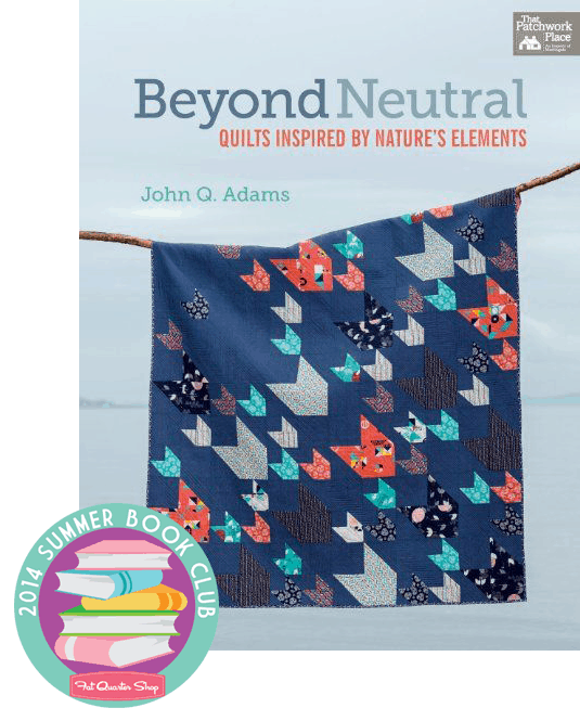
Beyond Neutral by John Q. Adams aka
Quilt Dad! (Btw! this book is 20% OFF until the end of June). John encourages us to be bold in our fabric choices and color selection and to look “beyond neutrals.” In this book, he created sixteen original quilts that do not use creams or whites as the neutral background color, but instead the colors of nature as his neutral palette. The quilts are cleverly divided into five elements of nature, Wind and Sky; Earth; Water; Leaves and Grass; and Lava, Coral, and Stone. Here are some of our favorites from each element.
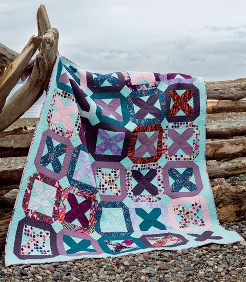 |
| Wind and Sky: Glacier Bay |
 |
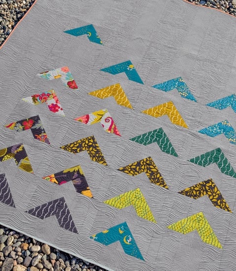
| Earth: Katmai |
 |
| Water: Pacific Crest |
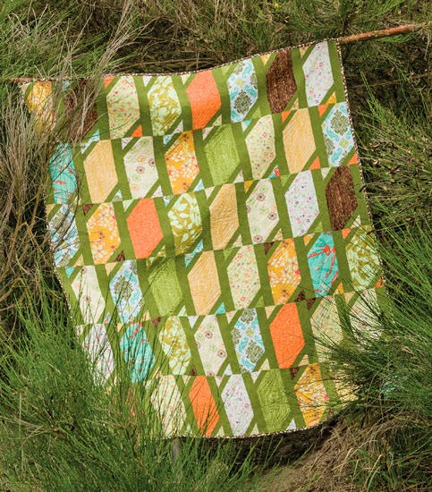 |
| Leaves and Grass: Fallen Timbers |
 |
| Lava, Coral and Stone: Pinnacles |
Watch Quilt Dad as he talks about Beyond Neutral during our trip to the 2014 Spring International Quilt Market!
It’s time for our 2014 Summer Book Club giveaway! We are giving away a stash of books to ten lucky winners from now until the end of August. To enter, comment below and let us know, how will you go
Beyond Neutral in quilting? One winner will be picked each week and all the winners will be announced August 26th. Good Luck and happy quilting!
Related

134 comments
Hi!!! Looks like a fun book!!!! I love color!!! All the quilts shown are beautiful!!!! Thank You
I absolutely love the navy background. I'm thinking a deep red/brown would also make an awesome background for something in the beige/yellow/orange tones.
Thanks for the chance to win.
I'm going beyond neutral with my next quilt for a baby. I'm going to do bright primary colors to inspire the baby!
I just made a quilt using a periwinkle purple background and I love it. I think I'll delve more into using different color solids as backgrounds.
I've been tending toward gray backgrounds most recently, from ash to granite. Nice change from white and cream if the fabric line goes well with cooler colors. This book has some very interesting ideas and I'm looking forward to reading more.
What lovely quilts! I agree that they encourage me to go beyond white and try other background colors. Love that navy quilt as well as the green one. I have lots of solids that I could use for backgrounds but I love little prints too. The wheels are turning! Thanks- K-
I'm moving to blues as my background color. Although I really like the red background and may try that soon.
What alovely giveaway! Thank you for having it. I have started using "inspiration" as my theme and color source and it is so much more meaningful and enjoyable to create that way. I even take pictures and use those palette apps from paint web stores that give you the colors right from your inspirational picture or photo. Sometimes the theme is enough such as a family tree or a book I've read. I have more inspiration than I do hours in a day though! LOL! Thanks again!
I am learning to use differnt colors and working to challenge myself out of the standard combinations I have used. (i'm a fan of 2 color quilts) Love John's blog so I'm sure I will love the book. THanks,!
I really like the navy and gray backgrounds. I would be willing to try a bolder background.
I've done a black and red quilt for my oldest son and that's a good start going Beyond Neutral.
My husband is a big supporter of my quilting and his favorite color is dark brown, so I think I definitely need to plan a quilt for him using that as my neutral!
Balance your spiritual energy and get in harmony with your soul by practicing these Radha-Krishna meditations.
Sri Gita Govinda
-A book written in the 12th century, this is a description of the intimate loving affairs of Radha and Krishna
http://www.mediafire.com/view/keqr4lqp7wr1rru/Sri_Gita_Govinda.pdf
Govinda Lilamrta
-An 400 year old book which poetically describes the eternal daily pastimes of Radha and Krishna
http://www.mediafire.com/view/uhcuigauc6uqiei/Govinda_Lilamrita.pdf
Ananda Vrindavan Campu
-This is probably the most poetic and intimate portrayal of Sri Krsna’s life in Vrndavana that has ever been written.
http://www.mediafire.com/view/k9j3ldwbt17be3b/Ananda_Vmdavana_Campu.pdf
Prayers of Service to Radha and Krishna (Sankalpa Kalpadruma)
http://www.mediafire.com/view/lvkqsro3sbzm249/Visvanath_Cakravarti_Thakur_Sankalpa_Kalpadruma.pdf
Prema Samputa The Treasure Chest of Love
http://www.mediafire.com/view/mpbncdyt97nw0x7/Prema_Samputa_The_Treasure_Chest_of_Love.pdf
And the following four are taken from Visvanath Cakravarti's Camatkara Candrika, a 300 year old scripture that talks about the love meeting of Radha and Krishna:
The Meeting in the Box
http://www.mediafire.com/view/c81a7cp43n5v6aj/The_Meeting_in_the_Box.pdf
The Meeting of Sri Krishna Disguised as a Female Doctor
http://www.mediafire.com/view/hgomrnem7829pda/The_Meeting_of_Sri_Krsna_Disguised_as_a_Female_Doctor.pdf
The Meeting of Sri Krishna Disguised as a Female Singer
http://www.mediafire.com/view/gyuboduhn8dvdml/The_Meeting_of_Sri_Krsna_Disguised_as_a_Female_Singer.pdf
The Meeting of Sri Krishna Disguised as Abhimanyu
http://www.mediafire.com/view/911h9qoxn4ca027/The_Meeting_of_Sri_Krsna_Disguised_As_Abhimanyu.pdf
And lastly, we have the supreme scripture which describes the 24 hour daily loving affairs of Radha and Krishna in Vrindavan, called Bhavanasara Sangraha. This book is now available on Amazon for Kindle, for only $3.49
http://www.amazon.com/Bhavanasara-Sangraha-Mahanidhi-Swami-ebook/dp/B00CW9H4DI/ref=la_B00J2M5LAQ_1_15?s=books&ie=UTF8&qid=1402209195&sr=1-15
Here is a 41 page sample of Bhavanasara Sangraha:
http://www.mediafire.com/view/t4gsse2d4sw0f8p/Sample_of_Bhavanasara_Sangraha.pdf
The above book can also be read on your PC using Amazon Kindle for PC, download here for free:
http://www.amazon.com/gp/feature.html/ref=kcp_pc_mkt_lnd?docId=1000426311
I totally want to have a star quilt with dark blue background or an other one with mint green.
This is just what I needed! I always need a reminder that bold choices are ok and not everything needs to be white and gray! Thank you for the chance.
That green sashing in Leaves and Grass is great! Would love to do something like that.
Love the green and the blue backgrounds! I'm going to try one of those.
I want to use a red dot for my next quilt background. It will definitely take me out of my comfort zone.
It is great to see quilts using colors other than cream or white for the background.
I like to use solid backgrounds but not the usual white or cream.
Shawn
I usually use white or off-white for my backgrounds but now, I'd like to start using different colours – yellow, maybe!
wlinda_ca at yahoo dot com
I have made some quilts of Zen Chic, in the last one "London Tube" I used purple. In modern quilts I always use strong colors as background
I've been dying to make a quilt with black as the background. It's coming soon, I swear!
I would like to try a gray background.
Looks like a really fun book! I'm wanting to branch out with background fabrics in colors other than white/off-white. I love that gray on the cover. Thanks for the chance to win!
I love that he made all the quilts without whites or creams for the backgrounds. Love the bold look of the quilts you previewed! I would definitely like to make less quilts with white backgrounds, and more quilts with bright bold solids.
I have a Kate Spain jelly roll and some baby blue for background picked out but haven't decided on a pattern. Thanks for a great giveaway.
I am by far a quilting newbie and have not done a quilt with anything but a white background. But, I love the outdoors and I am excited to bring more color and a natural feel to my next quilt!
I was really inspired first by a gorgeous quilt in Fat Quarterly which uses navy blue on the background, so much so that I immediately bought most of my supplies to get started from y'all! so that is how I intend to go beyond neutral in my quilting! I am not much of a fan of white/ivory so far my favorite neutral is grey! thanks for the chance to win! bookclub sounds fun!
I love navy as a neutral. Even green makes a good neutral. I think grass green or lime makes a wonderful background colour.
I recently purchased Twice As Nice fabric from the Fat Quarter Shop that was intended to be used as backing but I love the print and am going to use it as the focus fabric and use Bleached Denim as my neutral, this is quite a departure for me and I am very excited!
I'm making a quilt right now that uses gray for my neutral colors. I wanted the color in the blocks to stand out.
Love the book the patterns look awesome! would love to go beyond neutral for a baby quilt
I'm new to quilting, and so far I've not really used neutrals since I did 2 fun baby quilts. My next project is a navy, yellow, and grey quilt for my front porch! I love the greens and yellows in Fallen Timbers– that color combo might be next. Thanks for sharing! Sarah: crjandsbj(at)netzero(dot)com
I love using gray backgrounds! I rarely use a white one.
The quilt with the green background has me wanting to use a similar green for a background — maybe with Alison Glass fabrics. Love green!
I'm going beyond neutral in a baby quilt that I'm doing for a coworker. Lots of color!
Looks like a great book! I went "beyond neutral" by using yellow instead of white as a background for a quilt I did a few years ago…turned out great!
Don't pick me for a winner whatever you do! I made Glacier Bay for John and it was so much fun. Seriously though, this is a great book full of ideas as well as the excellent and detailed patterns. It really is a go to book – even if I am a bit biased!
I've been playing with fun background colors. I've recently tried – and loved – aqua! It felt really different.
Looks like a great book! I would like to make a quilt with an aqua background instead of my usual white or ivory. Thanks for the chance to win.
I would like to make a quilt with a jade background. I have something in mind, but I need to finish a bunch of projects before I can start another.
Great quilts! I'd love to use a navy or ice blue as a background. I'm working on a quilt now with an orange shot cotton and love it, so I'm ready for more 🙂
It has been my experience that any color will work well as a 'neutral' in a quilt design, providing that you use the right fabrics with it. Many wonderful old scrap quilts have bright red or intense green as 'neutral', for example, and look wonderful.
🙂 Linda
Right now I'm using chocolate as the background for my wishes quilt a long. It's out of my comfort zone but I love it!!
Water is my favorite..I would do it in the colors of the ocean.
I just finished a baby quilt using dark brown and med pink polka dots it is adorable and definitely away from the usual light pastels for a bay quilt.
I ordered the book so I can make an orange and navy quilt. Love the colors in this book.
Grey is my favorite neutral. I'm going to use it in a quilt I am making for my mother-in-law for Christmas.
Love using anything besides white as a background!!
I think I have actually only made 1 neutral quilt 🙂 I love bold and bright! I especially love turquoise as a background color!
I'm a big fan of the earth colors shown! Brown is actually one of my stock colors that I have extra of for sashing – it goes well with other colors without being super light.
I love the navy background. I have a quilt up next with a navy background but I'm looking for the "right" shade for the right price. I adore color so I'm never afraid to mix it up. How will I go beyond neutrals? I hope one day to mix fabrics that AREN'T in the same line. Daring! I know, right? 🙂
I tend to use a lot of autumn colors in my quilts. Thanks for the chance to win. It looks like a great book.
Planning on a color palette of Butter Yellow, Nautical Blue, Cream, and Gray!!! I love this book! I just keep changing my mind on which pattern to do first! 😉
I'm trying to go outside the box. I'm into red, gray and turquoise. Thanks for the chance.
Debi Horne
Love them all!
I don't think I have made a quilt with a traditionally neutral background! I also make a lot of childrens charity quilts and there is not a neutral in sight there. I really like the quilts you have made and I thank you for your inspiration.
Pauline
perry94022 at hotmail dot com
I've used black as a background often but now I'm gravitating towards navy and lime green.
I used to think that creams/whites/off-whites were the necessary "neutral" for a block background. It took some courage but I've experimented (sometimes successfully!!) with colors such as cheddar or lime green as the block background. If you know how far outside my comfortable those are you'd understand how "forward thinking" I have become 😉
Love the great ideas. Makes me think out of the "sewing box",. Would love to win the book for a dear 86 year old friend. She's a previous quilter that inspired me for years. She's had several shoulder surgeries, and is unable to sew anymore. But…..she spends her days and evenings reading. 🙂
I love all the quilts but I will make the water Pacific Crest quilt but I will call it Gulf Stream since I live on the coast of North Carolina. Great book.
Absolutely loving these quilts! I'm doing a quilt with batiks, and the background is going to be a mottled purple. I think it's going to be beautiful, as it has the whole rainbow of colors in it, but absolutely no white, black or brown. I'm ready for a different look.
John's book, Beyond Neutral, is on my wish list already. I would be thrilled to win a copy of it in this giveaway!!! I've only been quilting for 2 – 3 years. I haven't used white as a background yet. My first rail fence quilt project used orange, hot pink, black and other brights for a Day of the Dead quilt. Two more quilts had browns, rose/red and a little cream in them. I think that I'm already Beyond Neutral.
Nice quilts! This book would be great for ideas and inspiration. I have become a little bored with using white backgrounds. I used yellow for the path and border of my hexagon Grandmother's Flower Garden quilt. Using yellow required more care in choosing the other colors but I think it worked it out quite nicely.
I love using blue and gray for backgrounds in my quilts, I really like the look of Pacific Crest quilt so I am sure I would really use this book.
I love the cover quilt… I want one just like it!
My next quilt is using dark gray for the background fabric instead of white.
I would love to own this book.
Thank you for the opportunity to win a copy.
I will go Lava, Coral, and Stone! Oh yeah! Great giveaway!
I am going to start a quilt with teal, blue and navy in the blocks and a mint green background. Looks like water to me.
gigiv13@gmail.com
I have been trying to go beyond neutral on my quilts for a while now, but now I trend towards blues and greens! I would like to continue to go beyond neutral by using the warmer colors as backgrou,nds.
I would try navy or aqua. Already branched out to gray and feel that is the next step.
The navy background is quite stunning! I have used yellow as a background, and green. I think I would like to try Navy next.
Love his use of color! I would love to use non-traditional neutrals in my next quilt! Thank you for the great giveaway and inspiration!
I avoid neutrals when I'm making applique quilts, but since I'm not a fan of pieced blocks I really only like white as the background color. I'll have to work on going beyond neutral!
These quilts use colors that I would not normally use. So, would challenge me and I may learn to like them.
Patricia C
I've used mostly white/cream/tan/grey backgrounds and am starting one with a black background. I'd love to get more adventurous!
these colors just make me smile. I will be using more color.
I am in my sixties so I have not been bold and colorful. But ii bought a mystery quilt that is modern with bright beautiful Kona fabric.so there 🙂
I'm new to quilting and have used only white and cream for background. I would really like to try going beyond neutral using blue or grey or even green.
I have a quilt in process that uses gray as the background color. I'm really liking it.
I have used green and black for background before. I think navy or gray will next up.
I watched John's Quilt Market talk. The quilts featured in his new book are lovely. I'll definitely order the book. I plan to use a colored background on a quilt in the near future!
Good luck to John with this new book. It's beautiful. I'll have to admit the cover quilt, Water, is my favorite.
I like the looks of these colored backgrounds and this will be out side my box, but i'm excited to try it after seeing these beautiful quilts.
Love the colors on these quilts. Excellent!!
I am always looking for ideas for quilts for the guys in the family and these look great!!
I do use a lot of creams for my quilts. I might step out of my box and use the navy which I love on the cover of the book. Gray is my next choice. Thanks for the giveaway.
I love the navy background – I've never used it before, perhaps I will having seen this !!
I can't stay away from a good quilting book!
I recently made a quilt using a charm pack of bright colors intermixed with a charmpack of turquoise solid. I was quite pleased with the results. Thanks for hosting this giveaway.
My granddaughter is going to re-do her bedroom in green. I think she might need a green quilt to compliment the design.
I'm working on a quilt right now (Heather Bailey's "Lottie Da" fabric) and picked out a very pale pink/orchid almost solid color yesterday for the sashing. I knew that a cream just wouldn't give the very soft feel I wanted. I think I'm going to be quite happy with my choice… and I love the idea of going beyond neutrals!
I like to pick a "not so neutral" color with a small print and put it in where the neutral would go. Lime green is a neutral isn't it?
I am going to work on a Eastern star with First Nations colours yellow, red, black and white! Love the colours of your quilts above. Soft and gentle!
great concept for a book – though I don't think grey is an unusual choice of neutral. I'm making a quilt t the minute with a grey neutral. I'm also making another which will have yellow, blue and coral as the neutrals…
I'm just made a black and white with lime green quilt, and think that may qualify for going beyond neutral, as that was really a stretch for me.
I think I'd like to try Lime Or Lavender {LOL} just because it seems like fun! Thanks for the book club!
I love color and do not ever consider using white as a background. My go-to background colors are usually a light blue or light green; however, I love that navy blue quilt. I am going to have to try that!
A great book to remind us there are other colors that can be used as neutrals. I am going to try and keep that in mind when I plan my next quilt.
Thanks for the giveaway. I try to go beyond neutral by looking at more tone on tone fabrics for backgrounds.
If I would quit being a scaredy cat I would be fine! I am going to try the navy. Thanks for the giveaway!
Love the idea of using the blues and greens for water…probably aqua and deep teal!
I need to use more solids, in fact I just bought a whole bunch 😉 thanks FQS!
I would go beyond neutral and out of my comfort zone and make a modern quilt for my son! thanks!
Picking out neutrals has always been a chore because I ADORE colors! After this post, I'm definitely going to be trying out more non-traditional neutrals. Loving the wind and sky quilt!
My latest quilt that I am working on has a dark gray/brown for the background. That is way out of my comfort zone, but I really like it! I would love to win this book!
I love bright bold colors so this is so me! I'm thinking bright yellow background with lots of spring and summer prints. I need more fabric!
The title "Beyond Neutral" makes me think of allowing the neutrals to complement the other fabrics in a quilt, making the neutrals more than mere background elements.
I have a plan for a quilt using black background fabric.
jen dot barnard at btinternet dot com
Find best Online Jobs on Facebook…
JobzCorner
Nice post. I'm trying different background colour than white in my next quilt. Annaleena
My favorite is Wind and Sky. I always tend to go toward blues and purples and teals. I'm planning a halloween quilt with black as the background color.
Love his ideas, I'm going for a primary color background and I think I'll use at least 4 different quilts.
I have a quilt with an emerald green background percolating in my head.
This book looks great. I tend to stick with White or Cream as my neutrals- the Navy looks like a nice new neutral to try next!
Great book. I've been looking for a new project and this book has given me many new ideas. Thank you.
Oh gosh, I just love Fallen Timbers. It's going on my "must make" list with the same color palette. Thanks!
I gravitate to blues, so I love the idea of using a blue as the quilt background. That also saves me from needing to buy whites that I wouldn't otherwise use.
For me to go "Beyond Neutral" would be to get away from my go to background color of white and try something different, like ash or sky (looking at my Kona color card). Navy blue would be nice also….depending on the fabric. Thanks for the give away!
I would use them in my backgrounds
I use gray a lot for my neutral. I don't usually like to use solids either, I like tiny prints so it looks solid from a distance.
I'm drawn to quilts that are made with different colored backgrounds, rather than the standard cream and white. I'm in the process of finishing a quilt top that is mainly grey with a variety of bold colored batiks. The colors just pop against they grey.
I enjoyed John's presentation at Schoolhouse. I used to use lots of color in sashing but then turned to the whites and creams. I love all the color and will be glad to go back to more colorful quilt backgrounds. Thanks.
After seeing John's quilts I want to try using a color as a background on my next quilt. Thanks for the inspiration.
This looks like a fabulous quilt book!! I want to try a quilt using a bright color as the background.
I made my grandson two pillows using a dark blue, almost black background and I loved how they turned out! I will be using a taupe background in my next quilt.
I will be using some denim for a background for a picnic quilt. It should be fun!
Looks like a great book. I'd like to try using navy blue as a background. Thanks!
I am currently working on a quilt that I am using a rich dark brown as the background for some really bright fall fabrics. Thanks
dragonfly9716 at yahoo dot com
I love using not-white-tones backgrounds on quilts! Even better, I like to use patterns for the background and solids for the main design. Totally different! I should make more quilts. Better yet, I should finish the tops I have and really make them "quilts!"
http://justsomeboobs.blogspot.com/2014/03/alyof-march-complete-april-goals.html
I just got the light navy AMB solid in order to make a quilt with it as a background, I love the cover of his book as inspiration.
Looks like a fabulous book! I'm currently working on one with a navy background. After seeing these pictures, I'd like to try one with a green one!
I've never been one for white, in clothes or in sewing. So I'm always looking for a different background for my quilts and bags. I think browns and greens can really set off colors and patterns.