 Our featured designer today is someone we have just come to know. The first line we carried from her was Be Mine, a whimsical watercolor Valentine line which some of you are probably using right now for a certain special day in February. Now, we also have Bliss by Sue, a spring-colored garden of…bliss! Read on for her own thoughts on Bliss.
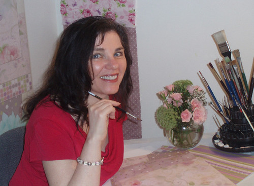
 My name is Sue Zipkin. I was so extremely excited to be asked to write on the Jolly Jabber blog. The Fat Quarter Shop is one of my favorite quilt store websites. One of the things I adore about their website is how they create wonderful vignettes featuring the newest collections from the best designers in the business. When I had found one of my designs on this website, that’s when I knew I had arrived in the quilt world. I’m not really sure where I arrived, but it was a great honor! Now that I will be able to talk about one of the new collections that they will be carrying I am in designer bliss. That leads me to the collection I will be talking about – more on that in a minute!
My designs can be found on many products across the board including dinnerware, greeting cards, outdoor decor, scrapbook collections, party goods and more. Ever since I started designing, one of my most thrilling projects to work on has been quilt fabric collections.
I am blessed to be able to design for a great fabric company called Clothworks. When I create a new collection, I work very closely with the design team at Clothworks. Since I am not a quilter, it is fabulous to be able to have input from people who have been quilting for years. We do a lot of editing as we develop a collection. As most of you who are designers and quilters know, the possibilities are endless. If it was up to me, my collections would consist of hundreds of fabrics per group. Since this is not realistic, Clothworks helps simplify and pull it all together beautifully.
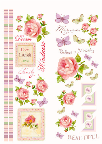
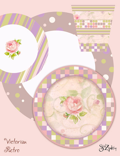
 “Bliss” was originally a collection I did that I called “Victorian Retro.” The reason I bring this up is because that is exactly what the pattern is about. I created this group a few years ago for my portfolio to show to different manufacturers. At that time I was in search of the right partner for my fabric designs. The “Victorian Retro” collection was a significant turning point in my designs. This was one of those Zen things that just seemed to come together from some other higher creative source. I recall I was painting roses and some soft watercolors washes and motifs. I then scanned them and started to bring in graphic elements in Photoshop like classic dots and stripes. I also incorporated some clip-art butterflies. I rarely use art that I don’t paint myself, but in this case I could not resist, since they do seem to fit the design.
What people seemed to appreciate most about the designs when I first showed them was the marriage of the soft and graphic elements. This can be tricky to combine the two. Here I have featured some of the original design presentations from the collection.
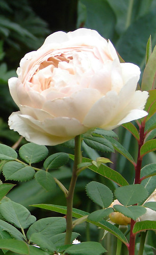
One of my favorite flowers to paint are roses, also one of the most challenging. I think many artists who paint flowers struggle with roses. To capture the essence of a rose is a very difficult task as there are so many layers and intricacies to hold together.
For those of you who are familiar with my designs I am often most noted for my use of bright color. “Bliss,” however, is not about bright color, as you can see it has a soft classic palette, although within the softness there are some bright playful combinations.
My next introduction with Clothworks, featured on their website, is “Samba.” This collection is a playful eclectic mix of colors – the classic bright palette I’m most known for.
 I would love to see what quilts you create with my Bliss collection, I am always impressed with your creativity! And thank you so much to all those who purchase my fabric and other designs.

2 comments
Thanks for the fun peek at the designer behind the pretty designs!
Fun!! I just had a request form my daughters for 2 pink and purple quilts. I think Bliss might fit that request! 🙂